Thursday, 22 April 2010

In what ways does your media product use, develop or challenge forms and conventions of real media products?

The media product that I will be evaluating is my charity website “Cambridge Animal Sanctuary”. My websites purpose is to advertise my fictional zoo and to ask the public for donation’s to keep my zoo running.


Starting with the layout

My website follows the conventions used by The London Zoo website, I choose to follow their style because it is a simple but attractive convention, but most importantly so my website is easy and straight forward enough to be used by an occasional web user. For example using a convention such as consistent navigation, basically this means placing hyperlinks such as “home”, “about us” etc. on every page. Doing this makes the site simple to navigate through. As shown below. also by using small pictures to represent words and links.


The London Zoo website


(notice how words as well as small images are used to represent links.)


I thought this was a good idea and rather fitting to my website.

The websites template, which I created follows a popular conventional style practiced by many websites. From top to bottom: a logo, which is horizontally placed, in the top left hand corner with an the organizations acronym on it. This was created using word processing tool in the Macintosh program "photoshop".


A navigation bar which is situated on the right hand side of the page is just below the sites logo, on this navigational panel there are four buttons providing links to the other pages. I have followed the common convention of placing these items vertically in an attempt to utilize page space effectively,which I think I have done successfully. Following these two items, there is a small space, this is done to spread the page out just a little bit so it does not have an untidy jumbled look. Towards the bottom of the page I decided to do something different with our footer so i created my own, i complied a selection of pictures; after rendering them i placed them at the bottom of each of our pages (as seen below) . i believe i have pioneered a new form of convention which i hope will catch on.

(Websites footer)

All of the content shown on my website was generated by myself ; pictures, icons,etc. Therefore it is my own creation. All of the pictures shown on the website were taken by my self, the fonts and graphics were taken from the web design tool "Iweb" and then edited by me.

HOW DOES YOUR MEDIA PRODUCT REPRESENT PARTICULAR SOCIAL GROUPS?

My website “Cambridge Zoo”, is charity orientated around the conservation of animals, therefore there are no particular human social groups which I seek to represent. It could be argued that I'm representing animals as a group and representing the issue of conservation. I believe what I'm really representing with this site are those who have interest in conserving our environment and the endangered species we have in it.


Layout
The layout of my website is a rather simple one, making it easy to use by those who are viewing it. I decided to follow the use of a conventional layout so those who are not seasoned web users would be able to navigate through my website without any difficulties. Although I used such a straightforward format, the web design of my site is still rather attractive.


Language
The language used on my web site is strictly formal. After conducting my web site research, I found that other sites were too wordy and filled with unnecessary sentences. Frankly after reading through some of the text they produced, I found it tedious reading through a website which was filled with useless information. After my experience, I did not want the viewers of my site to be bored of looking at paragraph after paragraph of boring facts. So for this reason I decided to use a more formal approach so I could communicate easily with all of the sites viewers and keep their attention; by keeping my text clear and concise.


Colour
I would class the colours I have used on my website as calming and neutral, I say this because the colour scheme of the site was not chosen to reflect any targeted social groups but to give a “jungle effect”, in other words to follow the theme of the content. so for example on the sea mammals section the pages are light blues and aqua greens and so on. Through out the site there are some variations in color but they are only in place to capture attention of the viewer for example the donate button. As seen below


(Donate button)


Graphics and Photographs

I thought if people could see what they were donating their money for they would be more inclined to give. For this reason I packed as many photos into the website as possible, the pictures taken are of vibrant and colourful animals in the best of health and of course with the help of the public this is a state which they can maintain


all of the photos on display were taken by me whilst on holiday, so I can truthfully say none of the photos on display were taken from any website our any other source.


The video

The video for the main website is brief one advertising the fictional zoo.


In conclusion my website is geared towards anyone who has a love for animals or just wishes to donate towards the conservation of animals. however i will admit; the design of the site is appealing to children.

Wednesday, 21 April 2010

Who would be the audience for your media product?

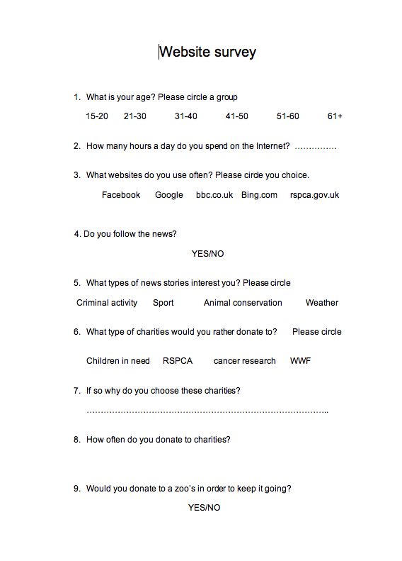
After handing out 30 plus surveys we have now established the audience for the website, Cambridge Animal Sanctuary. The question structure used on the survey was unbiased and sought to establish the preferences and habits of the public.

Using the survey, we established who our most receptive audience would be. After processing the completed surveys we discovered that web users between the ages of 21 and 30 with an income between eleven and twenty thousand pounds a year, were more inclined to donate regularly to charities which existed to ensure the conservation of animals.

Having this age bracket as my prioritized audience is rather important because as I mentioned before, this age group had the highest numbers of those who were willing to donate to an animal orientated charity such as mine.

how ever having the 15-20 age group as the second largest group by a small margin i have to be able to cater to them in someway also.


I created this survey to gain an idea of my target audience, I did this so I could ensure the satisfaction of those who were most likely to use my website.


[Picture+15.<span class=png]" border="0">
[Picture+16.<span class=png]" border="0">


After establishing who I'm catering for i realized that those most likely to donate to the Zoo are within the caring social group (21-30), therefore during my planning I ensured that I implemented persuasive language into my website along with images of healthy animals in well maintained surroundings.

Tuesday, 20 April 2010

How did you attract/ address your audience?

In the early stages of website construction my group and I did some website research, in order to note what difference a use full convention/feature made to a website. By doing this we were able to implement some of them into our website in turn making it easily accessible.


The target audience for my website is officially people in the age bracket of twenty one to thirty, although this is the case I believe the website should speak to all ages and for this reason I designed it with every age group in mind rather than confining it to the official target audience.

This can be seen through the:

Language used on the website, the language used on the website is formal and straightforward, simple language is used so anyone who reads any page of the site can understand what is being conveyed.

My website uses a blend of colours like subtle greens and light blues, these soft colors have a calming effect in turn welcoming the viewer of the website.

Positioning, the placement of items on the pages is quite simple, the logo for the website is in the top left hand corner of the page with navigational links just below it placed horizontally across the page the title of each page remains in the top left hand corner of each page thus creating continuity.

Font, the font size of the content on the web site is set at 12 allowing the users to comfortably view the written content, whereas the font size used on the titles of each page is set at size 23, such an increase in font size was used because my group and I understand the importance of clarity of the page title and the need for it to be easily differentiated from the other text.

After making all of these reservations for the users of my website, I would expect that there would be no problems with the clarity of text,pictures or navigation. Overall i expect public reception to be good because I'm confident in the product my group and I have put together.
Also with the help of my teacher i believe i have covered all spaces and produced a product of good quality.

Monday, 19 April 2010

WHAT KIND OF MEDIA INSTITUTION MIGHT DISTRIBUTE YOUR MEDIA PRODUCT AND WHY?

The distribution of a website is rather unique when compared to the distribution of other types of media material. In order for me to distribute my website effectively I need to go through the following steps.

1.)For search engines such as Google to find and list my website merely registering my domain name on the Internet isn't enough. A domain name is a name often related to the topic or theme of the website, which identifies websites.


To enable search engines to find a website, the website must be

2.) uploaded onto the Internet via a web host. A web host is a service which puts a website on the Internet allowing web surfers to search, find and view the website easily; but there are some costs for the use a web host's service's. The higher the cost the more control one would have over things such as the layout and the amount of content allowed on the website. Although the benefits of this option out weigh the con's, for a charity orientated website such as my own it would not be the best choice. I say this because it is a non-profit organization which seeks to spend as little as possible on its running costs.

Once this is done the website can be distributed via the Internet anywhere in the world.

Sunday, 18 April 2010

What have you learnt about technologies from the process of constructing this product?

Looking back at process of constructing my website, I realise that I have gained a considerable amount of knowledge on web design. When I first started the web design segment of this course, I thought the hardware/software would be intricate and extremely hard to use for a first time user like me. I was mistaken, the Apple Mac's we use are brilliant machines which are highly sophisticated and yet still very easy to use.

The same can be said for the Apple Mac's programme's. Most importantly the web design program 'IWeb' ,which is an integral piece of software responsible for the construction of my website. Although the web design programme 'IWeb' is not one of 'industrial strength' the reasons for using it is because html is complex to teach and the use of 'IWeb' allows a novice like me to create a professional looking website without having to input lengthy html codes.

Garage Band

I used this piece of software to create backing music for my video, at first i thought compiling my own track would be hard but the programme assists with the leveling the music and pitch, after

Photoshop

In photoshop I learnt how to manipulate images to my liking, by using tools such as the magic wand to select small pieces of the picture and paste elsewhere in other layers

Final Cut

In Final Cut I learnt how to edit the video for my website, cutting and trimming unwanted bits of the video capture so the final video would be short and enjoyable to watch, also i learnt how to effectivly use video effects like fade (as seen in the video).

Saturday, 17 April 2010

Looking back at your preliminary task, what do you feel you have learnt in the progression from it to the full product?

MY PRELIMINARY WEBSITE


Looking back at my attitude towards my preliminery school website, i realize my enthusiasim has changed. At first I used to be, a bit lazy; but yet my initial website was still quite good in quality, then i realized if I really tried; my main website would be quite good. With this I just decieded to dedicate myself to my work, ensuring all of the required reasearch was done and staying behind at school a little longer to work on the website etc.

1.)In review I learnt to understand the importance of easily being able to visually diffrenciate a page title from normal text.


2.)How to blend colors in such a way that pictures stand out against them.


3.)Ask for public opinion

I had my Media Studies teacher there to guide me, I still had to seek the opinion of my peers; where things such as colour schemes or fonts were concerned. I did this because my veiws and tastes my have not been the same as those held by my desired target audience, in doing this I had to develop a thick skin and embrace the critsism, and use it to help make my website better.

4.) How to manipulate various applications an editing software. My proficiency with editing software like photoshop and final cut was developed ten-fold after practice and trial and error.

Friday, 16 April 2010

Video for main website


This is the main video for my website, The Cambridge Animal Sanctuary.


This video that I produced for the Zoo, was compiled to give the potential patrons of the Zoo an insight of what we do. I managed to capture all of the best attractions at the Zoo and put it all together into an enjoyable video.


Thursday, 15 April 2010

Video Storyboard


I created this video storyboard so I could plan how I wanted my video to flow. I found that planning my video was extremely helpful whilst shooting and capturing film.

Wednesday, 14 April 2010

Photo slide show


These are the photos I used in my website.
These photos where captured by a myself whilst on holiday, the pictures where used to give those how may wish to donate an idea of

what they would be funding with their generous donations. These photos where not placed with the intent to pull on an heart strings although they may do, but for enlightenment also. However I did make a point of capturing images of healthy animals. Whilst learning about the representation theory I discovered that doing this was extremely important in consideration of being able to show to Zoo in the light that i wish.

Sunday, 11 April 2010

website drafts

HOW WE WANTED THE HOMEPAGE TO LOOK


TEMPLATE FOR THE REMAINING PAGES


These are sketch's of how I planned to design my website as you can see there are some variations between the sketch's and the finished product but overall I belive the changes made were benificial because they made the site more engaging.

Saturday, 10 April 2010

The Brief for my Website

I'm writing this proposal in order to create a website in support of a charity of my choice.
The campaign i decided to support was, animalcampaign.com. Animalcampaign.com are an organization who encourage the public to create campaigns for the welfare and benefit of any animal of there choice, I decided to choose this campaign because they allow users to campaign in anyway they think they can raise awareness and funds for the species of their choice.

After doing this i assessed my potential audience, when i thought about it i realised that my audience would be quite wide. I say this because the love for animals does not encompass age, any age person could be an animal lover; this means that I my group and I have to build this website with every age group in mind incorporating things that would address all age groups.
I assume that my website will go down quite well with my audience, by saying "quite well" i mean that I belive that my website will have a good deal of response from the users in the form of donations.